Transforming together: A new chapter in health research
For four decades, Menzies has been at the forefront of health research in the Northern Territory, expanding from Darwin to establish offices in Alice Springs, and Dili, Timor-Leste.
Today, we solve health challenges through leading high-quality research. By providing education and capacity strengthening, we empower health professionals, policymakers, and communities to drive life-changing solutions. While founded in the Northern Territory, our impact is felt far beyond. We lead global efforts to fight life-threatening illnesses in the Asia-Pacific and across the world and train the experts of tomorrow – today.
We believe everyone should have access to high-quality healthcare – especially those who need it most. By joining scientific knowledge with shared wisdom, we help to close the gap, creating healthier communities for all. But our results are only half the story. The true measure of what we do lies in building strong collaborations and creating meaningful employment opportunities for people affected by our work. After all, it takes local insights combined with scientific knowledge to create lasting change.
Our mission is simple – to shape a healthier, more equitable future where every community can thrive. We undertook a brand refresh to create a unifying identity that represents our organisation. Through consultation with staff across Darwin, Alice Springs, and Timor-Leste, and key stakeholders, we developed a contemporary identity that reflects our community-centred research approach. It honours our 40-year legacy and reaffirms our commitment to health equity through meaningful partnerships.
A fresh look that embodies our values
- Our community - Our community is at the core of what we do, represented by the circle in the centre of our logo.
- Our impact - The lines represent how every action, big or small, ripples outward to create positive change. They show how connections multiply impact, flowing across communities and transforming lives.
- Our connections - The lines show how we connect across different places and communities, weaving together diverse perspectives and knowledge. Their unique patterns reflect how each partnership enriches our research.
- Our strength - The central hexagon symbolises our foundation of knowledge, relationships and connections, with community-centred research at its heart. With our communities, we create an enduring foundation that amplifies the impact and reach of our work.
- Our excellence - Excellence flows from listening to community needs and fostering genuine partnerships. Our logo represents genuine and shared reciprocity, an interconnected spirit where community wisdom and research expertise flow together naturally.
Our Community
Our Impact
Our Connections
Our Strength
Our Excellence
New colours inspired by our surrounds
Our brand colours are inspired by the land we call home. Soil, Sky, and Sea capture the beauty of the NT and our connection to Timor-Leste. Anchoring it all is a deep, dark blue—a connection to the world.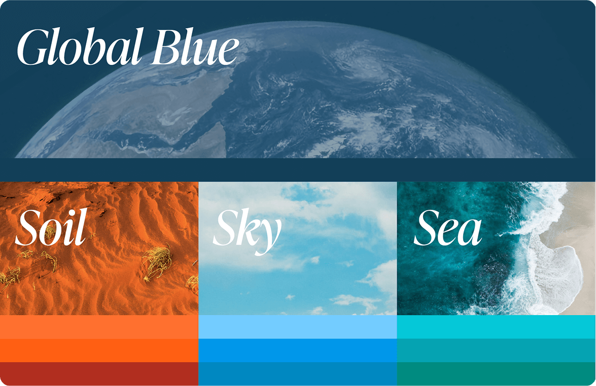
Our Commitment to Reconciliation
We deeply value our relationship with First Nations communities and are committed to ensuring their voices and knowledge guide how we approach representation and health research.
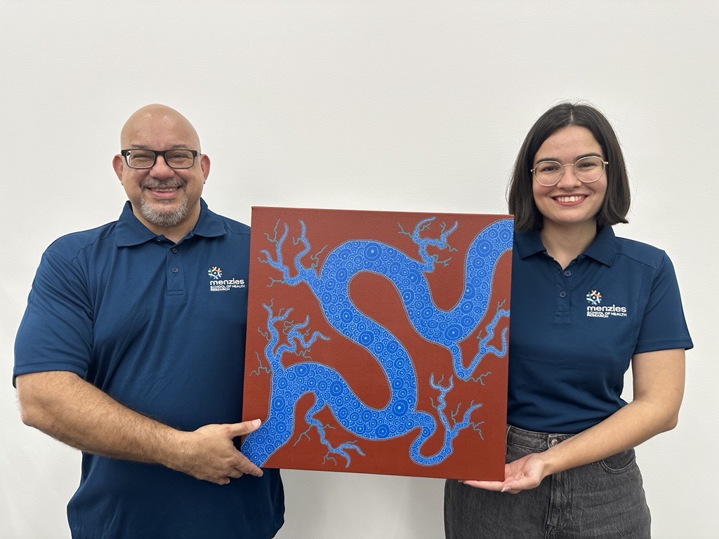
Through engagement with our Aboriginal and Torres Strait Islander Brand Advisory Group has been instrumental in shaping our new brand identity. During key Aboriginal and Torres Strait Islander Days of Significance, we are proud to feature a special brand overlay created by respected artist Jayde Hopkins.
This approach reflects our ongoing commitment to meaningful engagement with First Nations communities while respecting cultural ownership and authenticity.